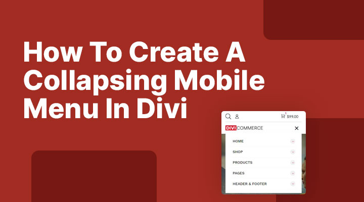
In this tutorial, we are going to build a collapsing mobile menu with nested menu items. If you have many menu items in your mobile menu, this can become a long list. With a collapsing mobile menu, we can make it a lot user-friendly.
This is how the collapsing mobile menu will look. When you click on a arrow the menu will expand and the second-level menu items will be visible.

You can see a live demo here.
Step 1: Adding the jQuery code
Add the following jQuery code to you child theme or in Divi > Theme Options > Intergration > Add code to the < head > of your blog
<script>
jQuery(function($) {
    $(document).ready(function() {
        $("body ul.et_mobile_menu li.menu-item-has-children, body ul.et_mobile_menu  li.page_item_has_children").append('<a href="#" class="mobile-toggle-icon"></a>');
        $('ul.et_mobile_menu li.menu-item-has-children .mobile-toggle-icon, ul.et_mobile_menu li.page_item_has_children .mobile-toggle-icon').click(function(event) {
            event.preventDefault();
            $(this).parent('li').toggleClass('mobile-toggle-open');
            $(this).parent('li').find('ul.children').first().toggleClass('visible');
            $(this).parent('li').find('ul.sub-menu').first().toggleClass('visible');
        });
        iconFINAL = 'P';
        $('body ul.et_mobile_menu li.menu-item-has-children, body ul.et_mobile_menu li.page_item_has_children').attr('data-icon', iconFINAL);
        $('.mobile-toggle-icon').on('mouseover', function() {
            $(this).parent().addClass('active-toggle');
        }).on('mouseout', function() {
            $(this).parent().removeClass('active-toggle');
        })
    });
});
</script>
Step 2: Adding the CSS code
Go to Divi > Theme Options > CSS and add the following CSS code:
/* #### Collaping Mobile Menu #### */

ul.et_mobile_menu li.menu-item-has-children .mobile-toggle-icon::after,
.et-db #et-boc .et-l ul.et_mobile_menu li.menu-item-has-children .mobile-toggle-icon::after {
	color: #da181f; /* Icon color */
	background: #f1f1f1; /* Icon background color */
	top: 10px;
	position: relative;
	font-family: "ETModules";
	content: '\33';
	border-radius: 50%;
	padding: 3px;
}

ul.et_mobile_menu li.menu-item-has-children.mobile-toggle-open>.mobile-toggle-icon::after,
.et-db #et-boc .et-l ul.et_mobile_menu li.menu-item-has-children.mobile-toggle-open>.mobile-toggle-icon::after {
	content: '\32';
}

.et_mobile_menu .menu-item-has-children>a {
    font-weight: 600 !important;
}

ul.et_mobile_menu li.menu-item-has-children .mobile-toggle-icon,
ul.et_mobile_menu li.page_item_has_children .mobile-toggle-icon,
.et-db #et-boc .et-l ul.et_mobile_menu li.menu-item-has-children .mobile-toggle-icon,
.et-db #et-boc .et-l ul.et_mobile_menu li.page_item_has_children .mobile-toggle-icon {
	width: 44px;
	height: 100%;
	padding: 0px !important;
	max-height: 44px;
	border: none;
	position: absolute;
	right: 0px;
	top: 0px;
	z-index: 999;
	background-color: transparent;
}

ul.et_mobile_menu>li.menu-item-has-children,
ul.et_mobile_menu>li.page_item_has_children,
ul.et_mobile_menu>li.menu-item-has-children .sub-menu li.menu-item-has-children,
.et-db #et-boc .et-l ul.et_mobile_menu>li.menu-item-has-children,
.et-db #et-boc .et-l ul.et_mobile_menu>li.page_item_has_children,
.et-db #et-boc .et-l ul.et_mobile_menu>li.menu-item-has-children .sub-menu li.menu-item-has-children {
	position: relative;
}

.et_mobile_menu .menu-item-has-children>a,
.et-db #et-boc .et-l .et_mobile_menu .menu-item-has-children>a {
	background-color: transparent;
}

ul.et_mobile_menu .menu-item-has-children .sub-menu,
#main-header ul.et_mobile_menu .menu-item-has-children .sub-menu,
.et-db #et-boc .et-l ul.et_mobile_menu .menu-item-has-children .sub-menu,
.et-db #main-header ul.et_mobile_menu .menu-item-has-children .sub-menu {
	display: none !important;
	visibility: hidden !important;
}

ul.et_mobile_menu .menu-item-has-children .sub-menu.visible,
#main-header ul.et_mobile_menu .menu-item-has-children .sub-menu.visible,
.et-db #et-boc .et-l ul.et_mobile_menu .menu-item-has-children .sub-menu.visible,
.et-db #main-header ul.et_mobile_menu .menu-item-has-children .sub-menu.visible {
	display: block !important;
	visibility: visible !important;
}

ul.et_mobile_menu li.menu-item-has-children .mobile-toggle-icon,
.et-db #et-boc .et-l ul.et_mobile_menu li.menu-item-has-children .mobile-toggle-icon {
	text-align: center;
	opacity: 1;
}
How to change the colors
At the top of the CSS code you will see this:
color: #da181f; /* Icon color */
background: #f1f1f1; /* Icon background color */
Here you can change the color codes for the background and icon.


Hi,
thanks for the great tutorial.
Do you have any idea how to create this kind of vertical menus like the one you can see here https://woodmart.xtemos.com/.
Thanks!
Edin
Hi Edin,
This plugin might be something for you:
https://wordpress.org/plugins/ap-mega-menu/
That is what I needed so much! Came in the most right time! Thank you so much, Mark! <3
You’re Welcome
Thanks Mark – that’s got me thinking 🙂
I have 2 menus in my header one on top of the other (One just wasn’t enough space!) However on mobile this gives me 2 hamburger menus which really doesn’t work. Could this be used with a little tweaking to combine the two menus to end up with the result you have shown here?
Fantastic, tips and child themes!
Hi Andreas,
No, I do not think that will be easy to do.
Is the reason that you use 2 menus that you have too many menu items for the desktop? And that it looks odd on small screen sizes?
Great tutorial! Thanks for sharing, this definitely comes in handy.
Really a great tutorial! I’ve had it bookmarked since you posted it and just today started using it. Already have it set up on 5 sites! Thank you for all you do to help us!
Excellent! Thank you!
Works like a charm. Thank you.
Thank you so much, my friend! The other jquery-Tuts didn’t work all along!
You saved me some bucks for a plugin, that I wouldn’t want to spare many for.
You, Sir, deserve my respect!
Where can I support you?
Greatings from Germany!
Awesome, works like a charm. Was exactly what I needed.
The instructions are also spot-on. Well done.
Thanx!!
This worked perfectly! Any chance you know how to make the mobile menu turn into an X when the menu is open?
Hi Michelle,
Change this in the CSS:
content: ‘\32’; to content: ‘\4d’;
omg, you just don’t know how much you saved me, been stuck for hours trying to figure out how to go about this. Thanks a million, times mark
Hi Leasben,
Glad to hear.
Hello there, i’ve tried your code but for some reason it doesn’t work. When i clicked on “v” button, the dropdown doesn’t show sub-page and close the menu. I added js on and css but idk why it doesn’t work. I also tried divi safe mode but nothing changed. I’m going crazy for this mobile menu.
Hi,
Do you have any caching plugins installed? or are you using a CDN?
If so clear those caches.
Also clear the static CSS in Divi > Theme Options > Builder > Advanced
And clear your browser cache
hi
this post is just perfect
thank you a lot!!!!!
Everything is working fine!
The only one that worked! Well done. A headache saver!
Good to hear it worked for you David.
Thank you so very much! Worked great! For some reason though, the arrow to expand a menu is red. I don’t have any red in my theme so I’m wondering how I would change the color of that arrow? Anyone know? Thanks again!
I got this sorted. Was an issue on my end. Thanks again for this code! Super, super helpful – and it just worked the first time I installed it!
Yup, worked like a charm, even now in 11/2023 Great solution!